Cathy Stones Counselling is a Private Practice founded over 10 years ago, delivering counselling and psychotherapy locally in Lincoln and Louth. Also offering online sessions for those further afield.
This website was created using WIX which we as a company try and stay away from. However in this case the client (Cathy) wanted to have full control if needed and decided the way forwards was to use a platform that was simple and easy to understand.
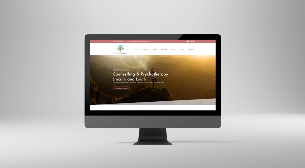
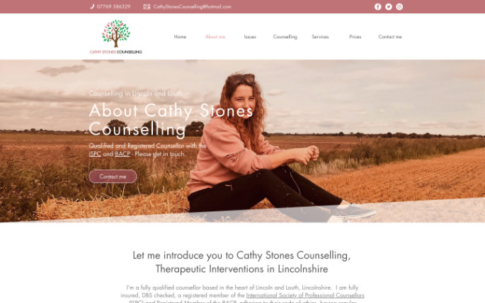
A new website was created to enhance her reach to those in need and that aligned with her morals, values and core beliefs. The website its self is a great example of a simple, run of the mill website using the clients own photos and copy.
The website began as just an idea. Cathy Stones wasn’t really sure what she wanted, but knew she wanted to be involved in the concept and evolution of the website. Communication was built up over a short period of time to get to grips with what counselling meant to her and so the design began to take shape.
Core information was kept as the forefront of the concept, utilising her knowledge of morals, values, ethics and the types of therapy that were to be on offer.
The challenge wasn’t so much about layout, or images…but rather more about how ethical the site really had to be. In most sites it is an out and out selling campaign, yet this stretched the team in communication and new language. I think we all benefited out of this website.
Furthermore the SEO work that we have completed took about a year and half for the web site to be ranked on the first page of google in Local Searches. This was on target and in-line with expectations and budget.
WHAT WE DID
SOFT AND SUBTLE DESIGN, A BODY OF KNOWLEDGE
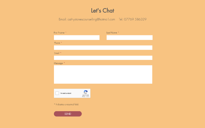
We built a soft and gentle website that delivers trust as soon as you land on it through hazy image features and engaging copy. The design has pastel colours against striking yellow tones throughout.
Each therapeutic landing page has been developed with the end-user in mind. We promoted a top down of importance hierarchy of information, ensuring the user can move down through the information until they find what they are looking for. Calls-to-action come in and act as sign-posts in the road if needed.
There is such a wealth of content on the site, perfect for anyone that is reaching out for support.